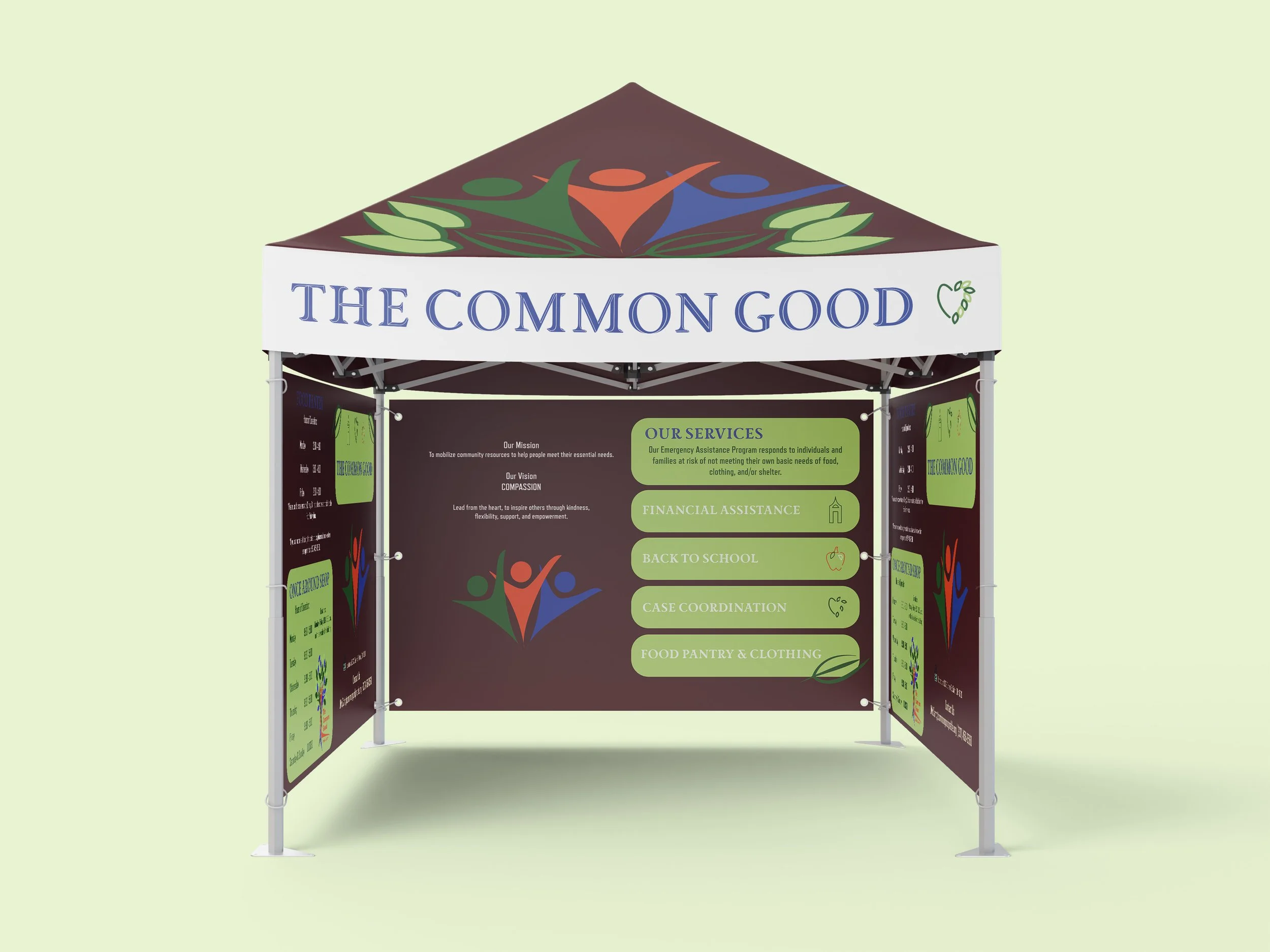
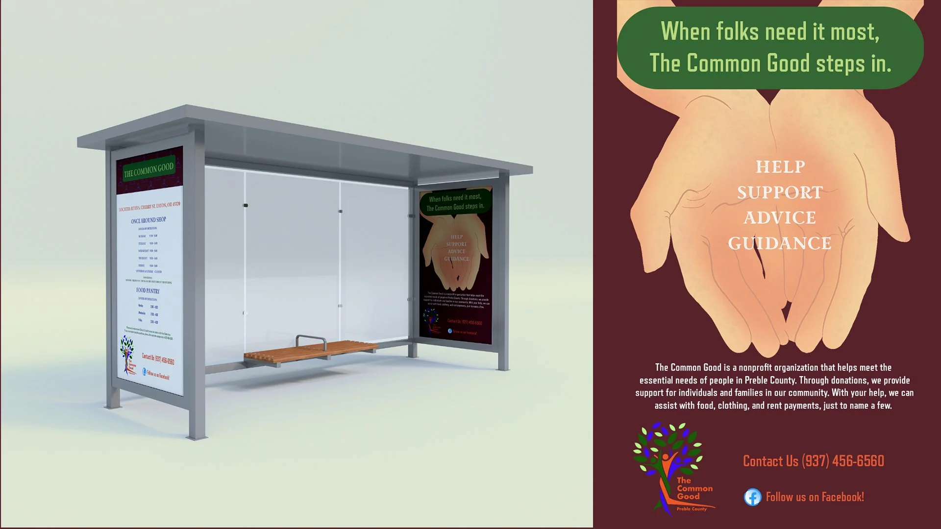
Designed to represent inclusivity, support, and collaboration. Through a harmonious color palette of green, orange, blue, and deep red, the design evokes growth, trust, energy, and warmth. Nature-inspired imagery and interconnected icons symbolize sustainability and community, while approachable typography balances professionalism with friendliness. The brand's visual language reflects its mission to empower individuals, foster collective well-being, and provide accessible resources. Together, these elements convey reliability, comfort, and a shared commitment to uplifting the community.


